STANFORD CTL CREATIVE EXERCISE
Hello, my name is Kyle Quevedo and I am a designer based out of Rochester, New York. This past week I was fortunate enough to take part in the Stanford/VPUE Creative Exercise. I found the Creative Exercise to be a fun and thought provoking challenge; I hope you find as much enjoyment following my design process as I did while working on this project.
-
The process of the design development for the new Teaching Commons logo. Breaking down the symbolism within the various elements of the logo. Exploring the different logo formats and going through rough perimeters for best use case scenarios.
-
Creation of multi-use, contemporary digital/print posters that can be integrated into upcoming e-newsletters, shared on social media, and printed across campus.
-
Images of the Teaching Commons’ logo and poster designs used in a variety of ways from print advertisements to digital social media assets.

“As a leader, it is important to not just see your success but focus on the success of others.”
— Sundar Pichai, Stanford Alumni & CEO of Google
RESEARCH
Breaking down the design brief to fully understand the project objectives and goals. Understanding the expectations going into the creation of this design exercise along with the research and development of ideas. Going through the early process work of ideating, sketching, and creating multiple digital compositions. This exploration and experimentation will help guide the development of these designs to their strongest possible final form.
DESIGN BRIEF
THE DESIGNER’S TASK
The Center for Teaching and Learning, part of VPUE, is endeavoring to rebrand a primary web resource called Teaching Commons. The objective: to elevate understanding of the variety of resources instructors can find on Teaching Commons and to ultimately increase site traffic as the content team enhances the site. As part of the rebranding project, you’re invited to bring a creative solution to leverage a new potential Teaching Commons tag line—chosen from the list below—in a multi-use, contemporary digital/print poster that could be integrated into an upcoming e-newsletter, shared on social media, in addition to a limited number of posters that will be printed and posted in select academic departments.
Potential tag lines:
• Teaching Commons: Learning together how to teach better
• Teaching Commons: Dig. Grow. Discover.
• Teaching Commons: The hub of teaching and learning at Stanford
• Teaching Commons: Learn together, teach together
CTL is also envisioning the creation of a new Teaching Commons logo/identity mark that could be incorporated into a range of Teaching Commons related media: integrated into its web site, featured on the new poster design, etc. (Please note that Stanford identity guidelines prohibit the use of the Stanford name or its various identity marks to be altered in any way, so any Teaching Commons logo/identity mark should be a stand-alone design; that said, the logo could incorporate the parent name Center for Teaching and Learning).
PROJECT GOALS
Creatively leverage a new tag line (of your choosing) from among a few choices through a digital/print poster design that will be used in a variety of ways and formats at Stanford.
Develop a multi-functional logo/identity mark for Teaching Commons that connects with the tag line you choose.
Please include a “vision board” or designer statement that walks the client through your thought process leading to your solutions.
All of the above should be sent/shared with vandanen@stanford.edu by:
9 am Pacific, Monday, March 28.
RESOURCES
• Teaching Commons web site
• Stanford Identity web site (with tool kit recommendations for font/color
palette to help ensure general brand family consistency)
• Potential source images and CTL logo (attached in email)
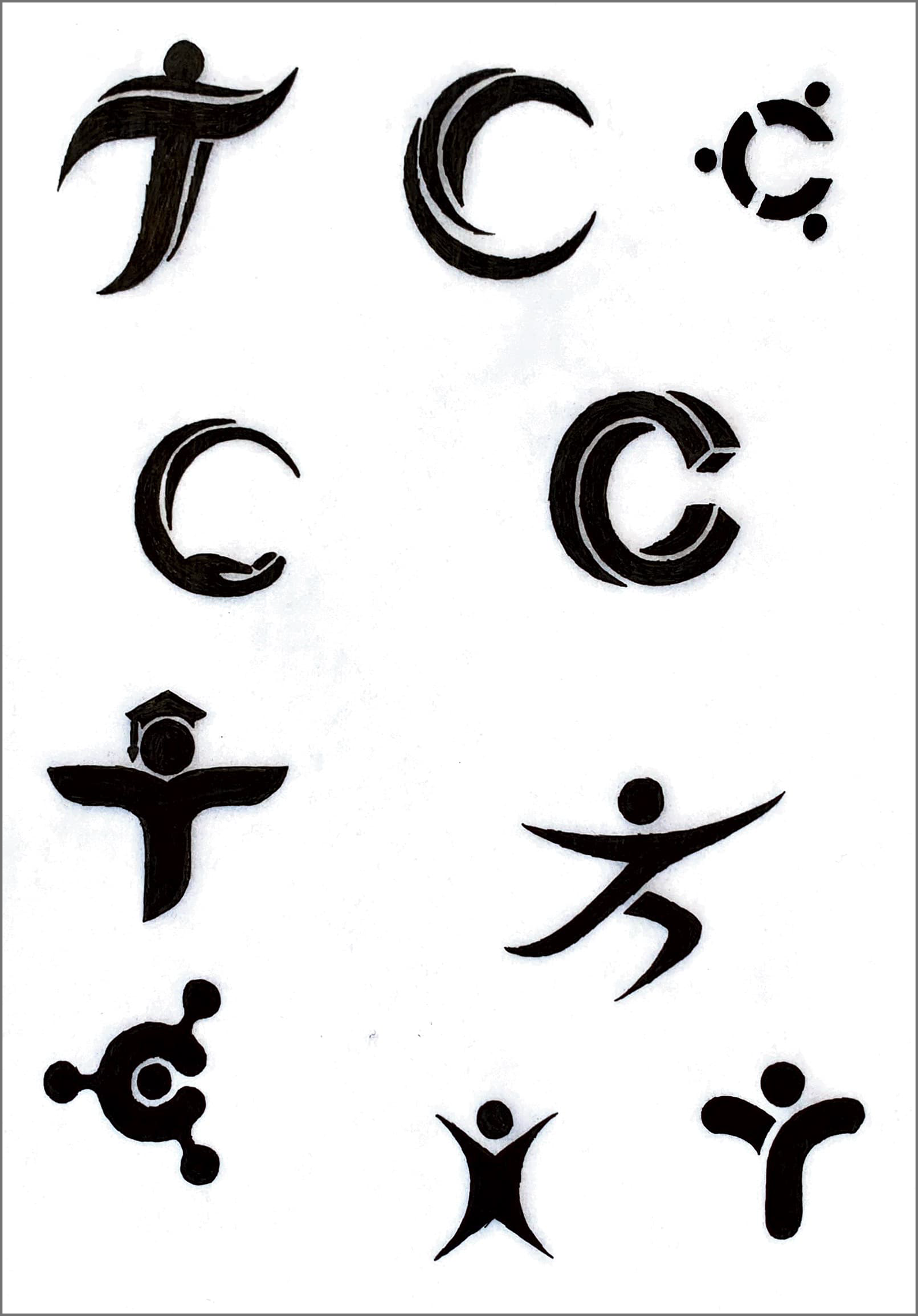
SKETCHES


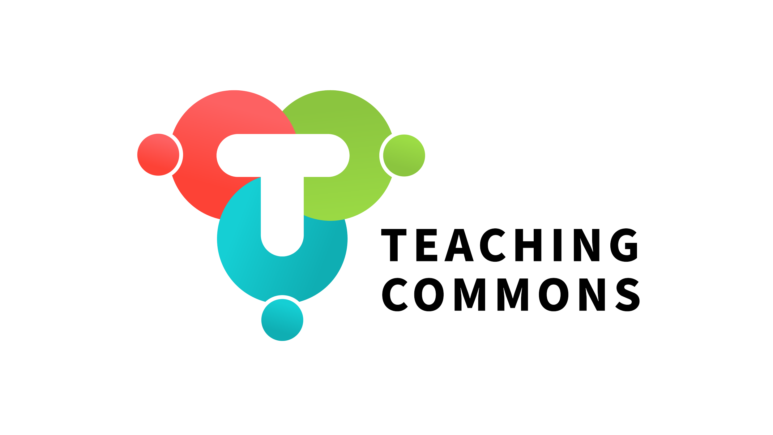


FINAL LOGO
After thorough research and experimentation, landing on a design that looks clean and professional while communicating the ideals of the Teaching Commons. Creating a simple and clean yet thoughtful and intentional design that can easily be successfully used throughout the brand design system.


ELEMENTS OF THE LOGO

SYMBOL
The logo mark was designed to illuminate the core values that make the Teaching Commons as well as Stanford University as a whole, the gold standard of higher education. The mark represents the uniqueness of each of us as individuals and the strength we gain when we come together. The mark is made up of three separate pieces, each with their own shape and color. Alone, these shapes would appear incomplete, however as an aggregate, they represent the spirit of unity and equity. Together, they embody a fair and balanced approach to education where all students are granted the opportunity to soar.
Each segment of the logo is meant to represent a member of the Stanford community whether that be an instructor, TA, or support staff. The logo represents the tagline of the Teaching Commons: “Learning together how to teach better”. To me, the main takeaway from that line is better together. That is exactly what this logo represents with each one of these pieces coming together to form one unified approach to teaching. This logo represents the idea of a community growing together in a safe environment where everyone’s individuality is welcome and honored, yet it is when they are unified, that they form a coherent, responsive community of educators. Each piece is intended to look like a member of the Stanford community coming together to learn how to teach better. As a designer, I love when logos have little details or easter eggs that are left for the consumer to discover and once seen, cannot be unseen. I purposefully included the element of discovery in this logo. The logo pieces come together to form the Teaching Commons initials, TC. This is meant to be a fun little easter egg that adds another level of representation to the logo.

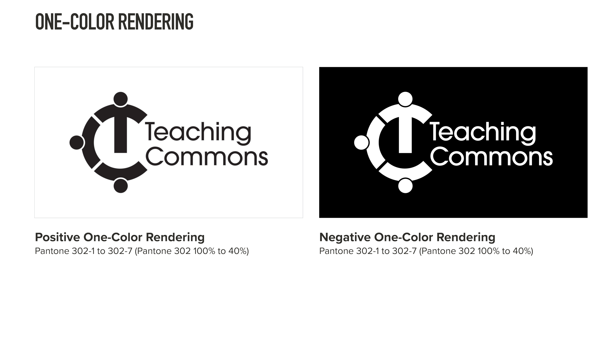
COLOR
The colors used come from the Stanford branding. These colors will help the logo stay on brand and recognizable under the greater umbrella of the Stanford Center for Teaching and Learning. It was clearly laid out in the brief that the Teaching Commons logo needed to be a stand-alone design not associated with other preexisting Stanford logo assets. With that being said, through using design elements such as color, the logo still fits in stylistically and is recognizable as part of the overall Stanford brand. This allows the logo to stand alone as its own entity while also being a sub-brand of a larger design system.

TYPOGRAPHY
The typography which I chose may be a small detail but is very important in continuing to communicate the messaging as well as the ideals behind the logo and the Teaching Commons. The typeface is Avante Garde. This typeface is an extremely versatile font with a balance of traditional and modern elements that epitomize the ideals behind the Teaching Commons. Avante Garde is an organic rendition of geometric san serifs which makes it easy to read with eye-pleasing shapes. The round shapes in Avante Garde matched well with those in the symbol and seemed to flow effortlessly together to make a perfect pairing. This type also has a very friendly and approachable feel to it while still looking professional and sophisticated. The type here needed to do a bit of a balancing act, it needed to have a soft and inviting look to it while also looking professional and business-like. This typeface has a very comfortable and humanistic look to it. I used lower case letters to keep the messaging non intimidating and inviting; had I used all caps for example, it may seem like you’re shouting at the viewer and make the logo feel more tense or threatening. I tightened the kerning on the type to keep the theme of unity and coming together. With the type being closer together it helps create a greater feeling of comfort, safety, and unity. There is a thin line between tight kerning successfully communicating comfort as well as unity to give the type a friendly, appealing look versus having tight kerning make a design claustrophobic and uncomfortable. The subheading text which is the Teaching Commons tagline is the typeface Proxima Nova. This is a very simple, clean, and professional typeface that is also very versatile. The tagline is meant to contrast the heading in style in order to balance the piece as a whole. The text is set in all caps and the kerning is tracked out to 100. Since this is the exact opposite of the attributes used in the headline, it adds elements of depth to the typography and the logo as a whole. The contrast of these two lines when paired with using different sizes and weights to the fonts come together really nicely, creating a very balanced and dynamic final product.
THE DIFFERENT LOGO FORMS

PROS OF MULTIPLE LOGO FORMS
One important aspect of designing a successful logo is to create multiple versions to ensure that the logo has
the versatility to be effortlessly transitioned into a variety of uses. With distinct forms, you have the freedom to
use various layouts, allowing you to choose the one that suits the needs of the situation best. It is important to make sure all layouts clearly fall under the same design system and are quickly recognizable as part of the
same brand family.
With this teaching commons logo, each variation is scalable so that the logo may be used in everything from posters to social media posts. If the logo was needed in a client pitch deck as part of the footnote placed on each page, it would make sense to use the Glyph Logo as it is the most scalable for small spaces and is still quickly recognizable as the brand mark communicating the Teaching Commons ideals without even using text. When designing a poster or digital composition, as you will see in my later designs, depending on the layout and spacing of the poster, it may be better to have a longer horizontal logo that takes up more space or you may need a more geometric condensed version of the logo to fit tightly and neatly into the corner. Having these different variations allows the designer to use whichever best suits the situation and helps seamlessly balance the composition.

USAGE OF THE PRIMARY LOGO FORM
This is the primary full form of the logo. This form includes all three aspects of the logo form: the brand symbol, the brand name, and the brand tagline. Since this logo form includes the most information of all other forms, it’s usage would be in instances where space and size are not an issue. Additionally, the intended use of the primary full logo form would be more successful as a stand-alone piece, allowing the viewer to effortlessly digest all information.
This logo would be used in instances where an enlarged image is needed. However, with the small text of the brand tagline, it is not the most scalable version and is therefore not adequate to be used as a small-scale brand mark. The primary full logo form would not be suited for usage in the header of a document or as the icon of a mobile app. Those examples require the simplest form that can scale down the smallest and still be easily read
and recognized.
This form is intended to be used as the focal point of a design. It should be cohesive with the brand and scaled appropriately for effortless recognition. This logo form is perfect to be featured on a building sign, a cover slide for a presentation deck, or as a multi-use printed sticker.

USAGE OF THE STACKED LOGO FORM
Compared to the full version, this logo form is simpler and more versatile. Featuring only the brand symbol and name, the stacked logo form is much more scalable, therefore making it useable in almost any content. The stacked element creates a very balanced and geometric appearance. Stacked text allows for the type and symbol to be approximately the same size and weight. This places equal importance on each aspect while allowing the logo to scale at the same ratio. It’s versatility is exemplified in cases with other log forms where the symbol is much larger than the type. The symbol and type become very disproportionate in the scale down of the logo. The symbol is made small but the type becomes microscopic. This results in a severe offset of balance with the logo. In the stacked form, both symbol and type are similar in size and weight, allowing them to scale at the same ratio.
This logo form also allows for the fluent union of type and image. Rather than being two separate entities of symbol and typography, the two elements interact with one another to form one cohesive logo. This logo form is extremely condensed and efficient, the ideal option for content with limited space. Possible uses for this logo form would be in the header of documents, a corner logo lock up on a poster, or an embroidered logo on a brand shirt.
USAGE OF THE HORIZONTAL LOGO FORM
Quite simply, this is an alternative version of the stacked logo form. Like the stacked logo form, the horizontal logo form offers a simplified, more scalable version of the logo. The single line of text in the horizontal form makes the text larger than the symbol, thus making it the focal point. Though it is very scalable, it is not as quite as versatile as the stacked form. This logo form works well in layouts that match its horizontal orientation, such as a web banner. It is a good option when you need to maximize horizontal space making it very useful in long narrow compositions. For example, The Stanford Center for Teaching and Learning logo is a similar long, horizontal layout. If both the Teaching Commons and Stanford CTL logos needed to be placed on the same composition, the horizontal logo form should be used. Visually, it pairs well with the other logo and creates balance when used properly. If you placed the Teaching Commons logo on the top left and the Stanford CTL logo on the bottom right, their similarity in size, orientation, and layout would create ideal balance in the design composition as a whole. This logo form works very well for formats such as a LinkedIn banner or as the logo form on a desktop website.


USAGE OF THE GLYPH LOGO FORM
The last but certainly not least logo form option is the Glyph. The glyph is essential to the family of logo forms as it is the simplest and most scalable logo form available. Its primary function is to remain easily recognizable even when it is extremely scaled down. The signature aspect of the glyph is the display of the brand symbol without any typography. An advantage of using the glyph is avoiding the potential issue of typography becoming illegible when scaling down a logo. No typography, no problem. It is crucial to have a glyph logo form option in terms of optimizing versatility. In order to successfully translate a full logo into glyph form, the original brand symbol needs to be strong, dominant, and able to communicate the brand’s ideals independently of any type of messaging. This logo symbol embodies the brand and represents everything the Teaching Commons stands for. The colors used create a strong, dynamic presence, garnering the potential to successfully stand on its own. Appropriate usages of this logo form can be seen as an app icon cover for mobile devices, or as opaque watermarks for the background of brand stationary.
All in all, each design deliverable is uniquely tailored to solve a specific problem. Every prompt needs to be thoughtfully treated as its own. There is no exact formula used to determine what, where, and when to add a logo form to a piece. The designer must work with the composition and the other elements in the layout to find that balance and seamless fit. Having various logo forms allows the designer to have much more flexibility and freedom when it comes to finding that right fit and achieving that seamless balance. There are obviously general case use perimeters in place to help guide the designer on which logo forms work best in possible instances. However, at the end of the day the final decision needs to be an educated and informed judgment call on what form looks best and is successful in that specific instance. Again, having a range of dynamic options allows the designer the ability to confidently make those decisions and reach the strongest possible outcome.
LOGO ANIMATION
Here is the logo turned into an animated GIF. Adding the element of motion helps make the logo even more dynamic and versatile. This animated logo could be used on social media posts, video content, email banners, or presentation decks. One of the great things about GIF files is they play automatically and they loop indefinitely. This way you don’t have to worry about clicking a play button to start the animation and then having it come to an end and sit on a blank screen.

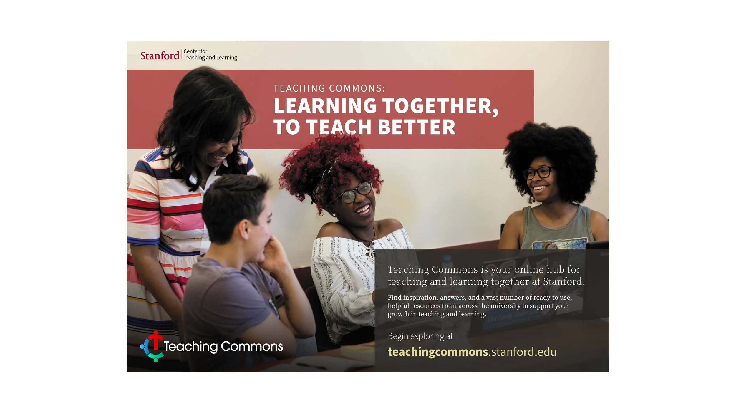
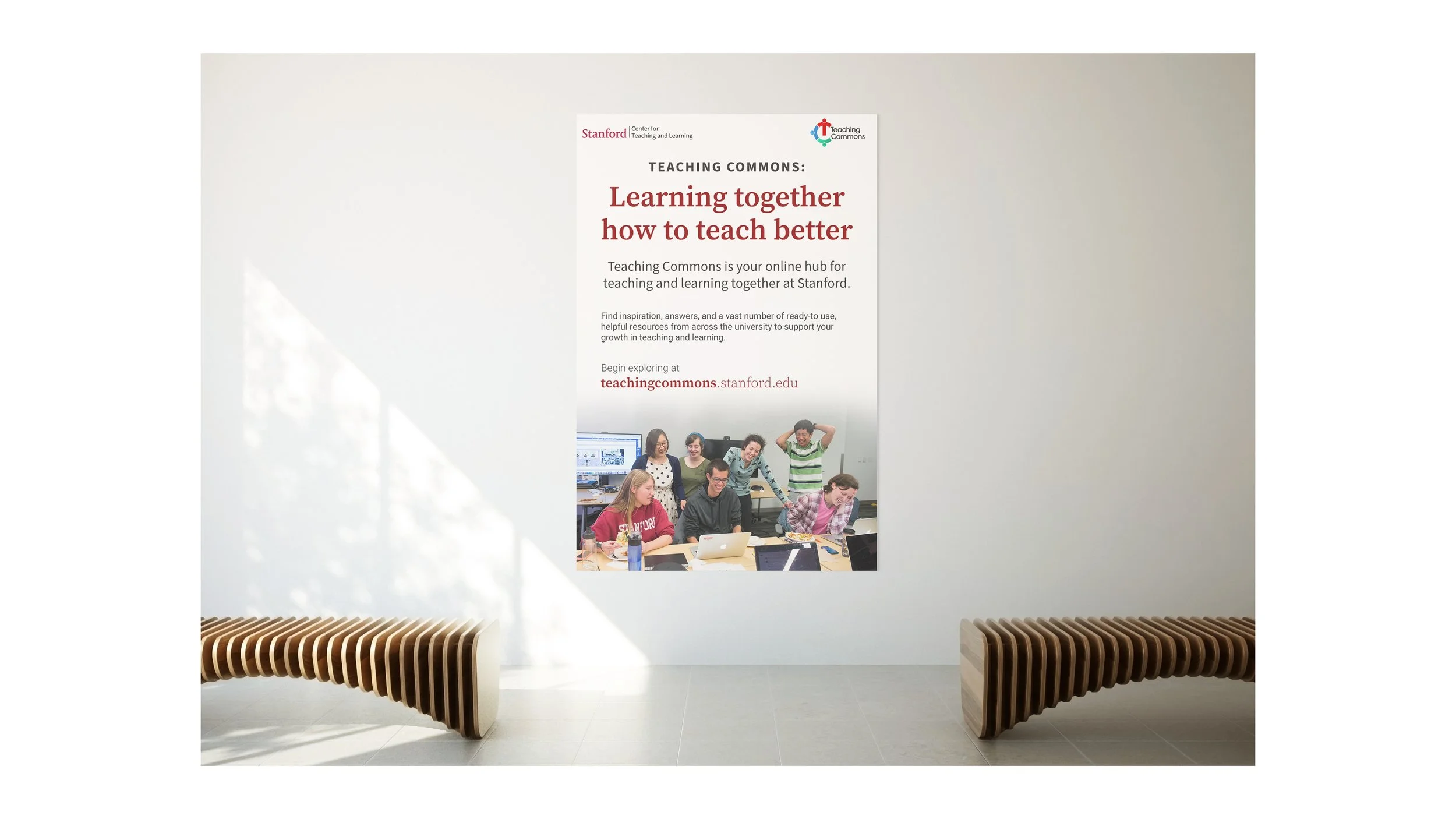
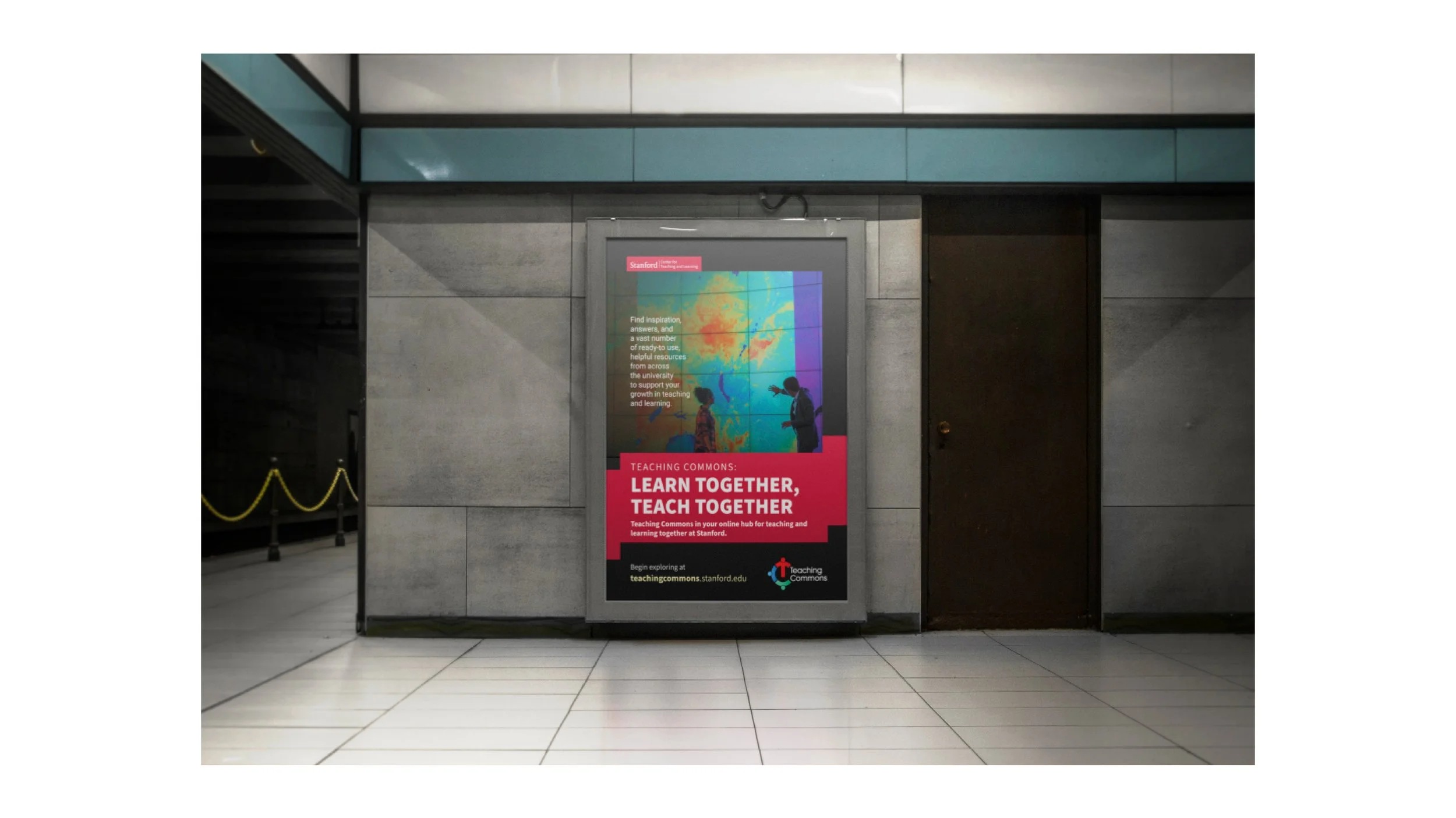
MULTI-USE POSTERS
Creation of multi-use, contemporary digital/print posters that could be integrated into an upcoming e-newsletter, shared on social media, in addition to a limited number of posters that will be printed and posted in select academic departments. Posters range in different sizes and orientations to give diverse options for a variety of possible usages.

1 of 17

2 of 17

3 of 17

4 of 17

5 of 17

6 of 17

7 of 17
8 of 17

9 of 17

10 of 17

11 of 17

12 of 17

13 of 17

14 of 17

15 of 17

16 of 17

17 of 17
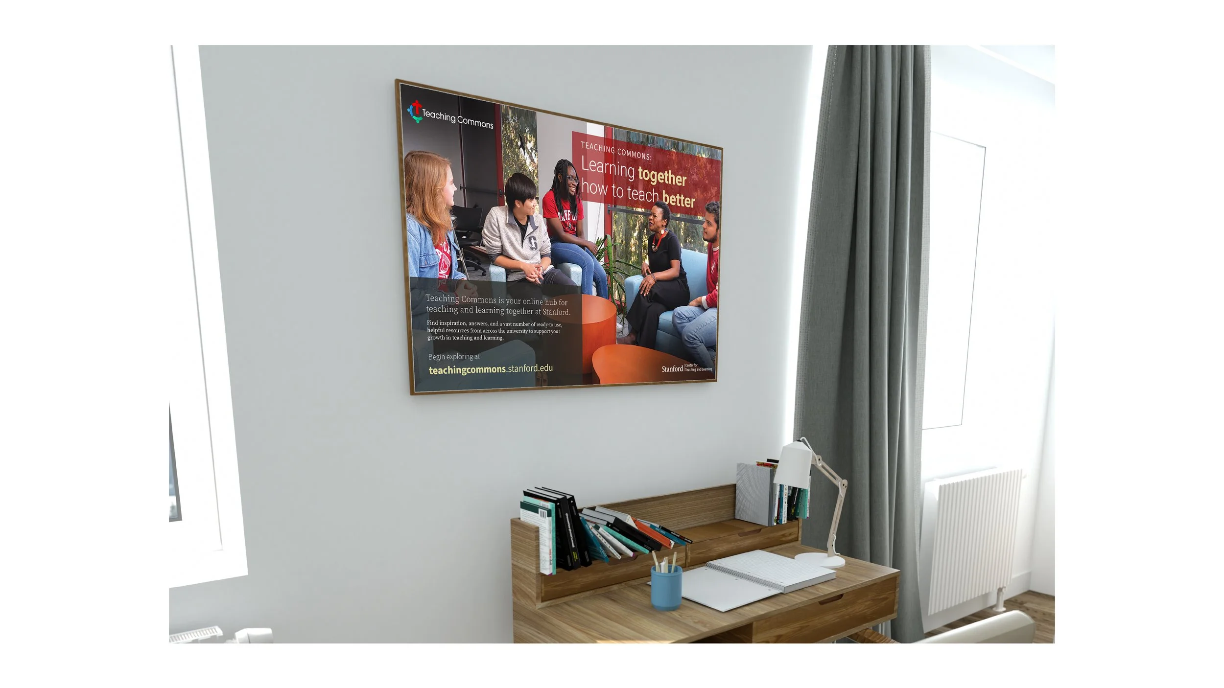
LIFESTYLE IMAGES
Image mock-ups of the Teaching Commons’ logo and poster designs used in a variety of ways from print advertisements to digital social media assets. These images help give you a better idea of how these design assets would exist and look in real world scenarios. These images help showcase the diverse range these design assets have in terms of usage.
Building signage


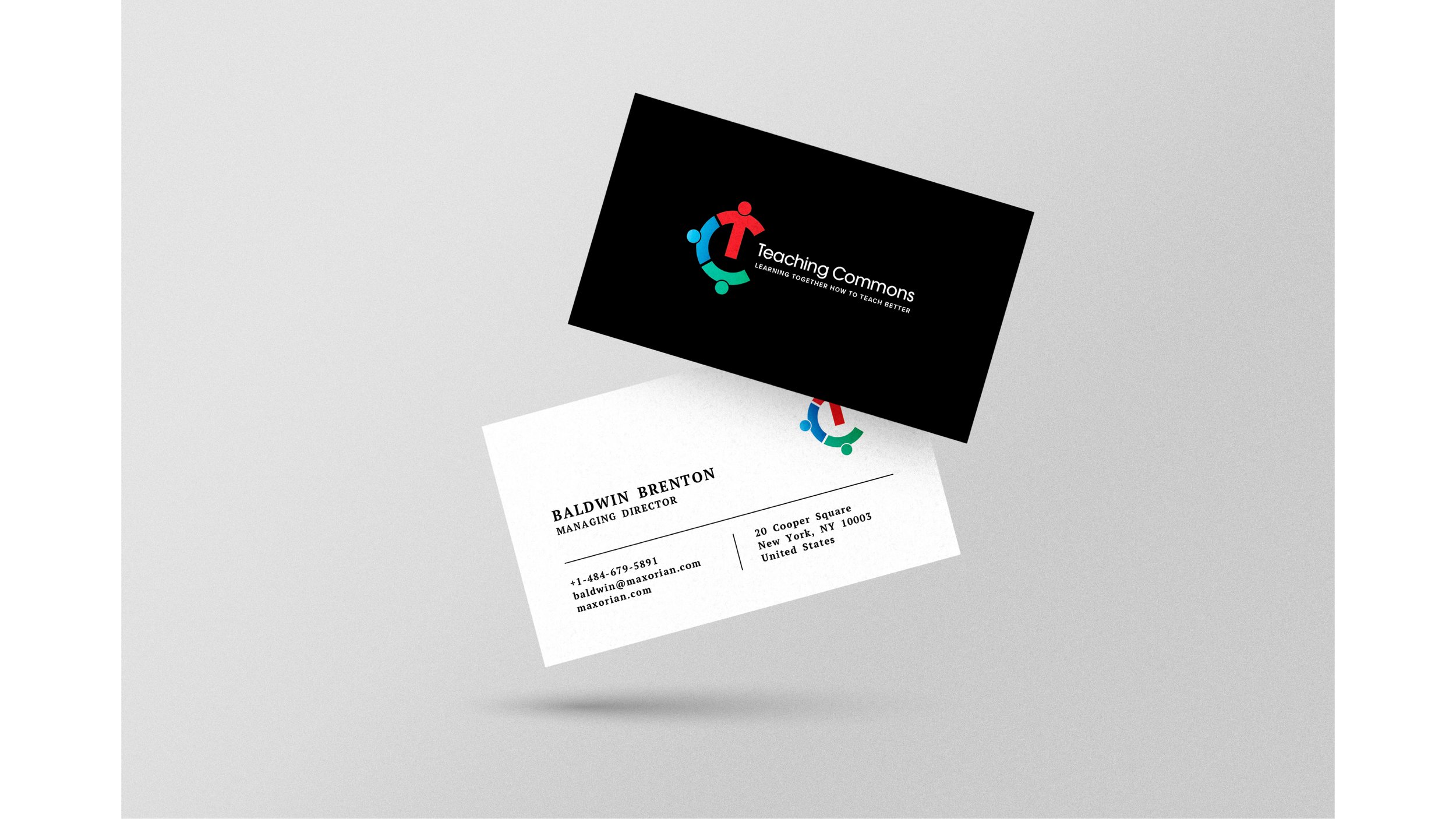
BUSINESS CARDS


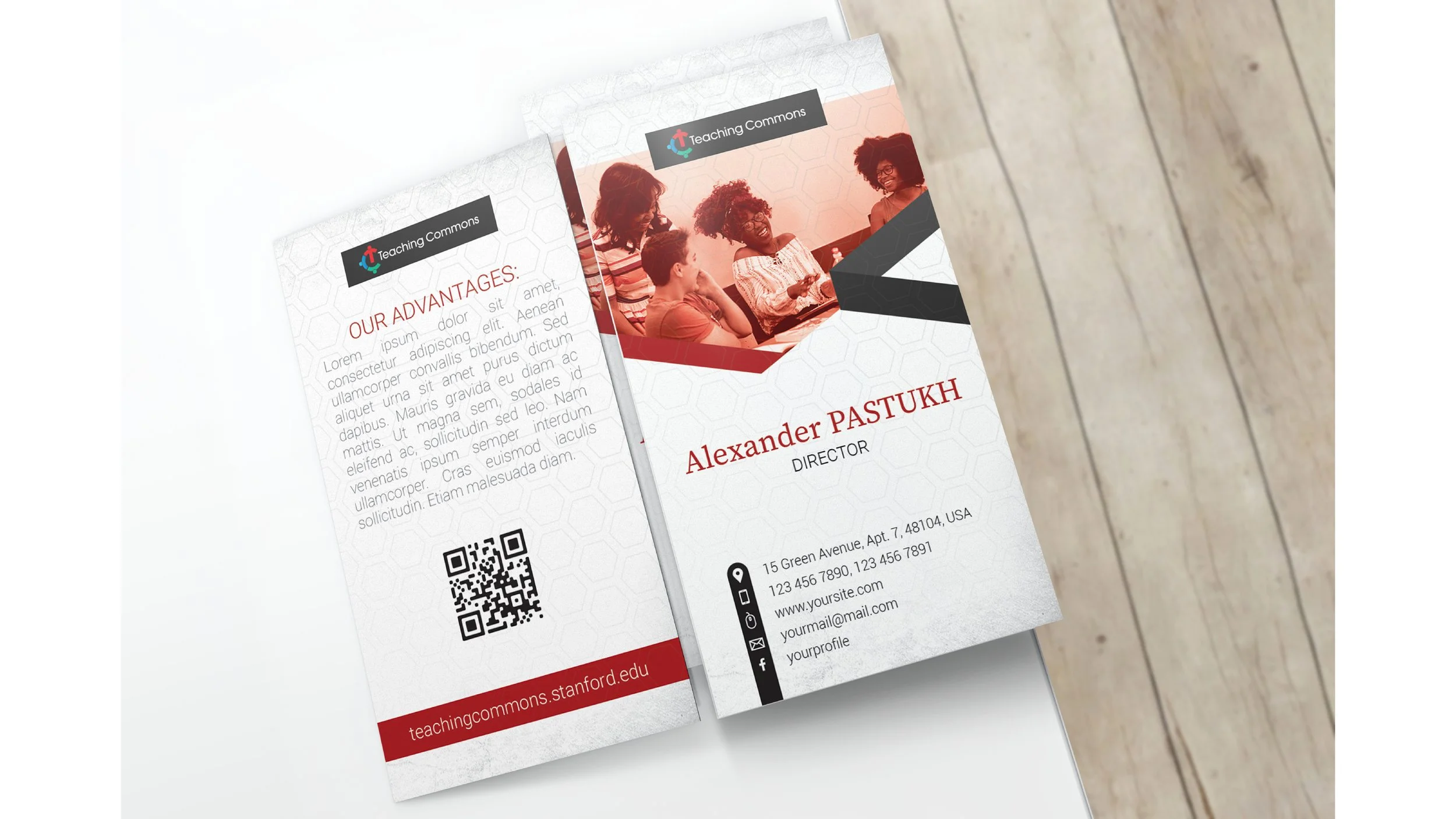


OTHER PRINT ASSETS
STATIONARY

DESK CALANDER

FOLDERS & ENVELOPES


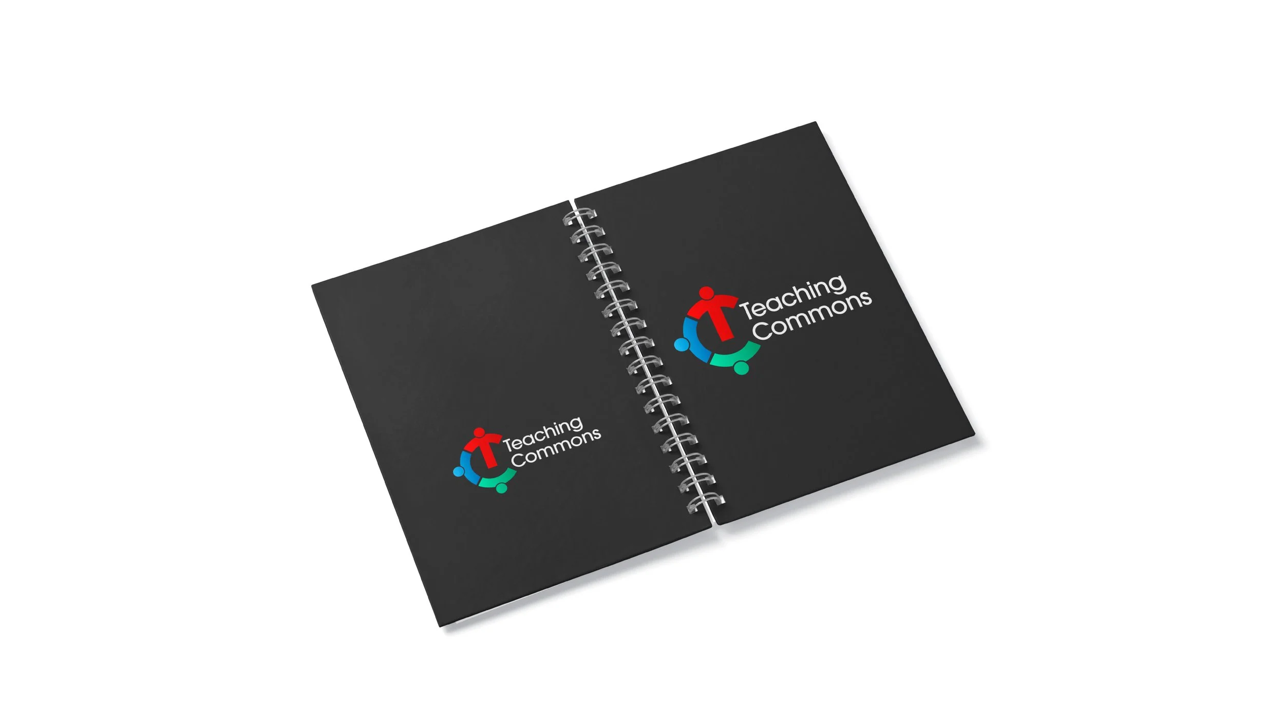
NOTEBOOKS


PRINTED POSTERS

1 of 33

2 of 33

3 of 33

4 of 33

5 of 33

6 of 33
7 of 33

8 of 33

9 of 33

10 0f 33

11 of 33

12 of 33

13 of 33

14 of 33

15 of 33

16 of 33

17 of 33

18 of 33

19 of 33

20 of 33

21 of 33

22 of 33
23 of 33

24 of 33

25 of 33

26 of 33

27 of 33

28 of 33

29 of 33

30 of 33
31 of 33

32 of 33

33 of 33
DIGITAL CONTENT


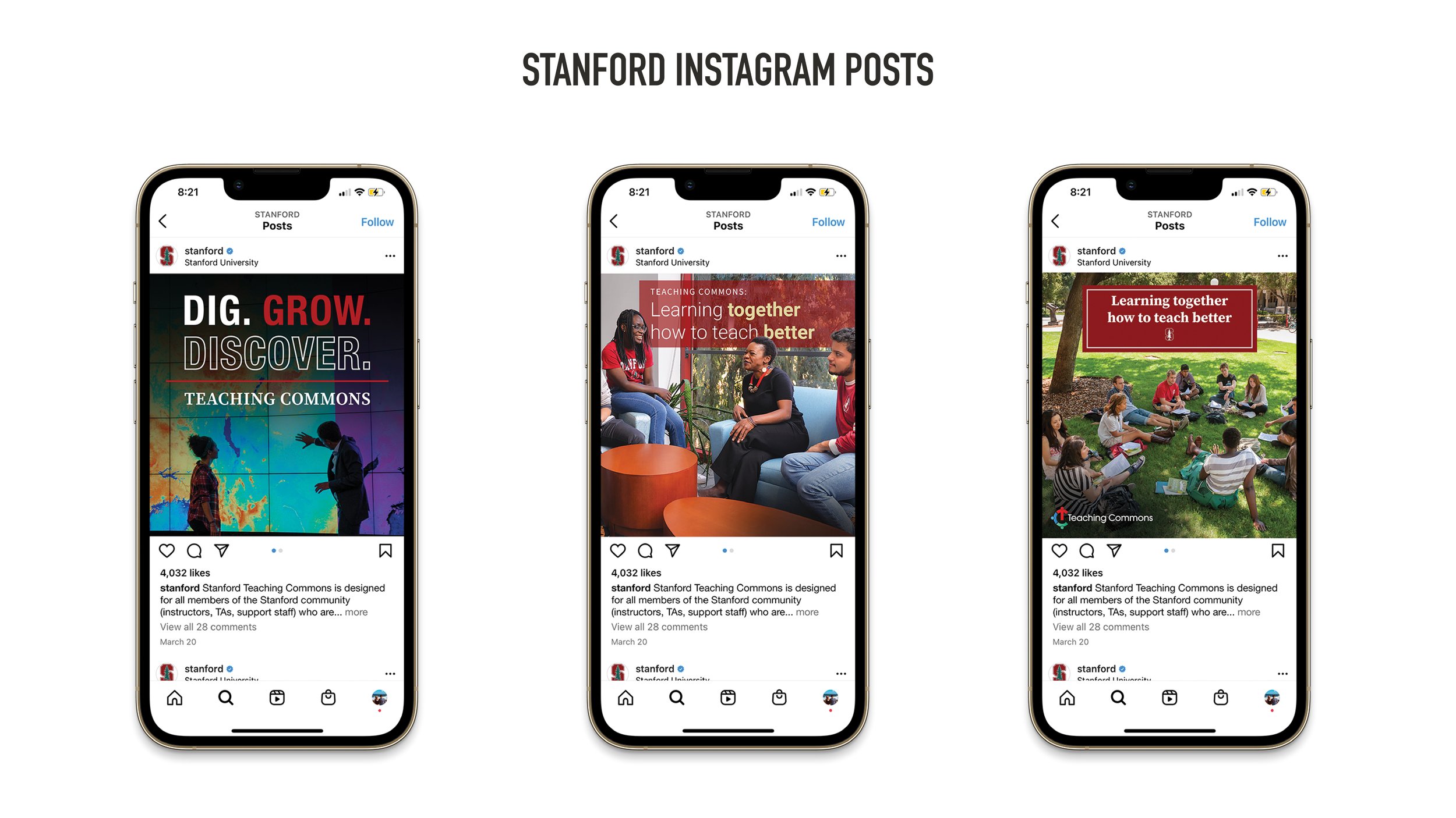
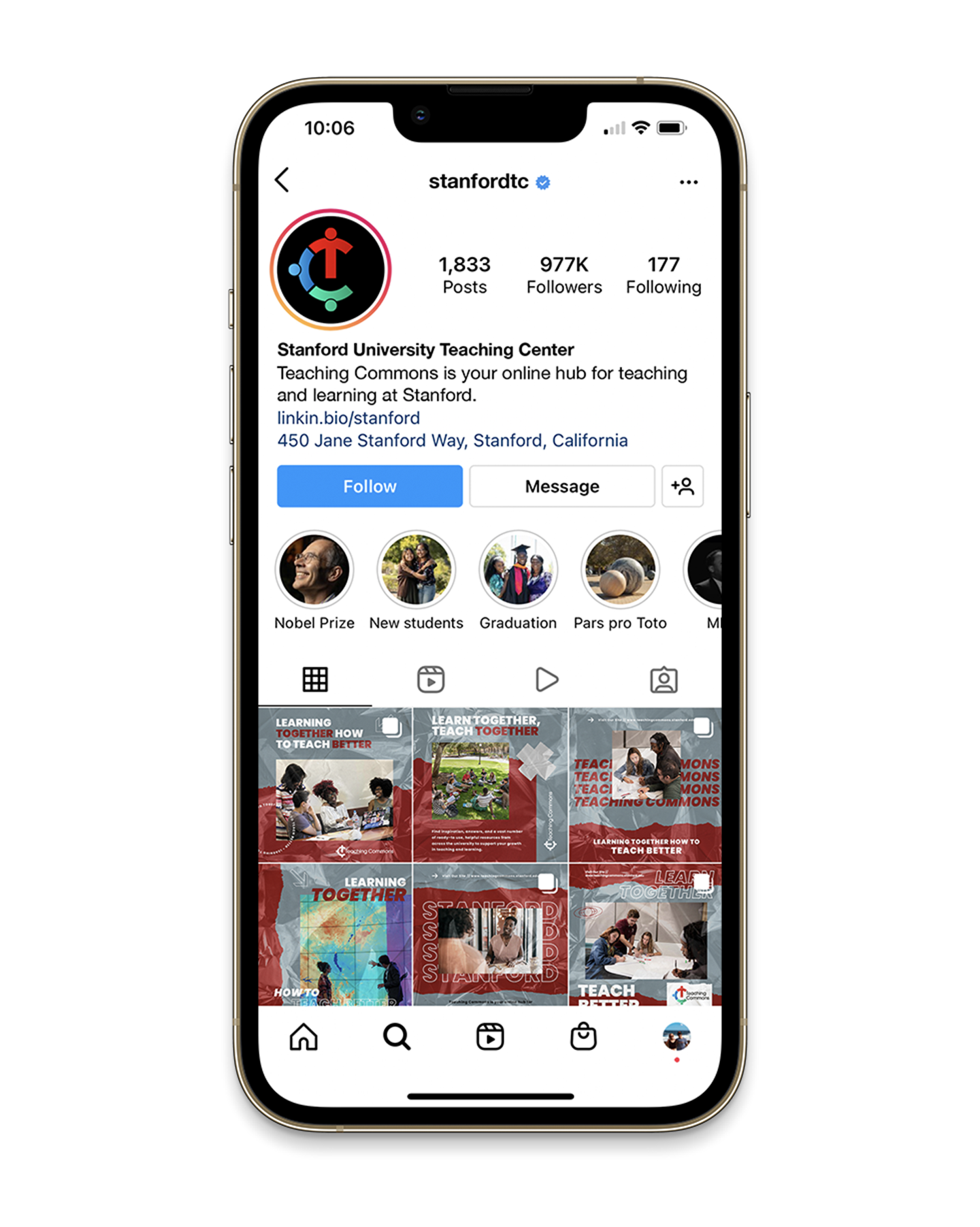
instagram BRAND campaign
This would be the Teaching Commons Instagram campaign with the goal of promoting the new branding and spreading the word about this resource to the Stanford Instagram community. Whereas the previous Instagram post mockups were by the official Stanford profile, this would be the creation of the Teaching Commons own Instagram profile. This would help elevate the brand while also increasing brand recognition. Here, the Teaching Commons is promoted as an independent entity while also being a sub-brand and falling under the larger umbrella of the Stanford brand. Having it’s own profile allows the brand to develop a unique design system promoting a creative and recognizable style that is associated with the page. This design system rebrand could be used as part of a Instagram profile roll out campaign to help quickly and strategically grow awareness for the Teaching Commons and their resources.


INSTAGRAM ANIMATED DIGITAL POSTER STORIES
Here are some examples of taking the Teaching Commons print poster design elements and turning them into animated digital posters that could be used as brand Instagram stories or posts. This adds yet another potential application to these versatile design assets in helping promote the brand as well as reaching the Teaching Commons target audience in an interesting, engaging, and interactive way.

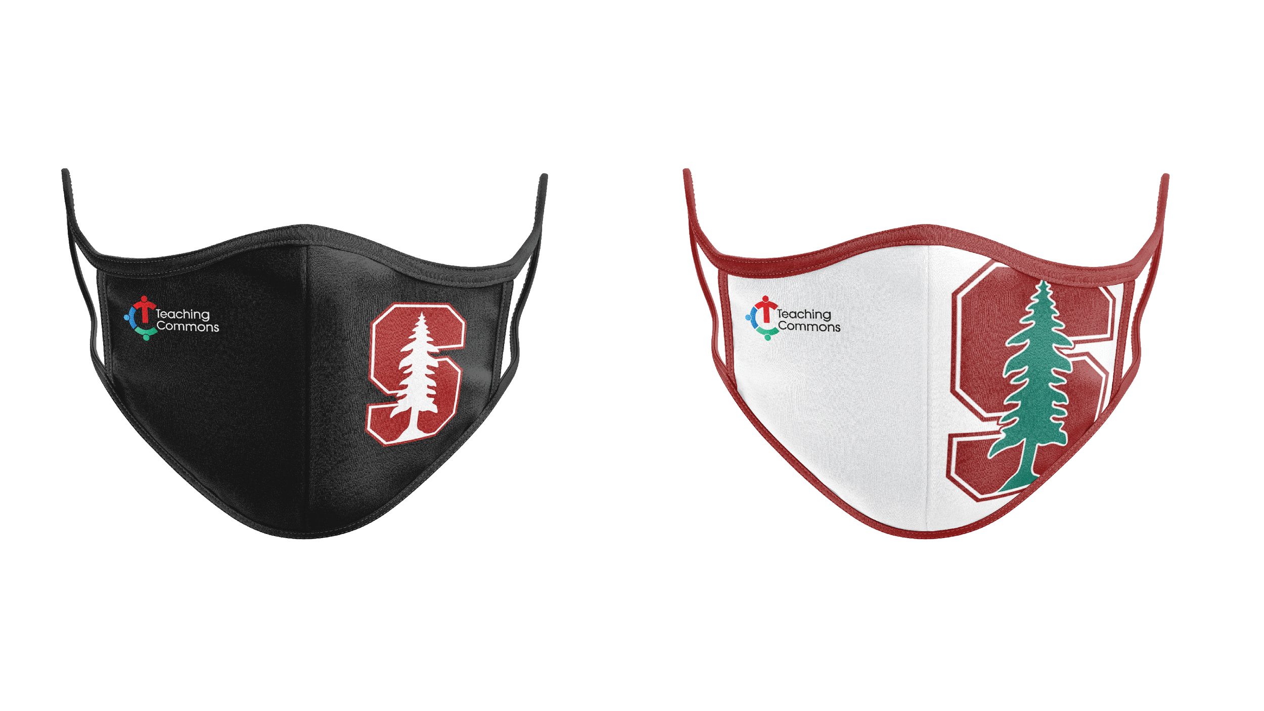
BRAND MERCHANDISE
Licensed Stanford Teaching Commons products to help grow and promote the brand. These branded products will range from clothing to academic supplies. These branded products will help grow brand awareness while also increasing brand recognition. Having physical products can also elevate the users experience of working with the brand while also spreading awareness to potential new users.